Personal Brand | Renato Rique
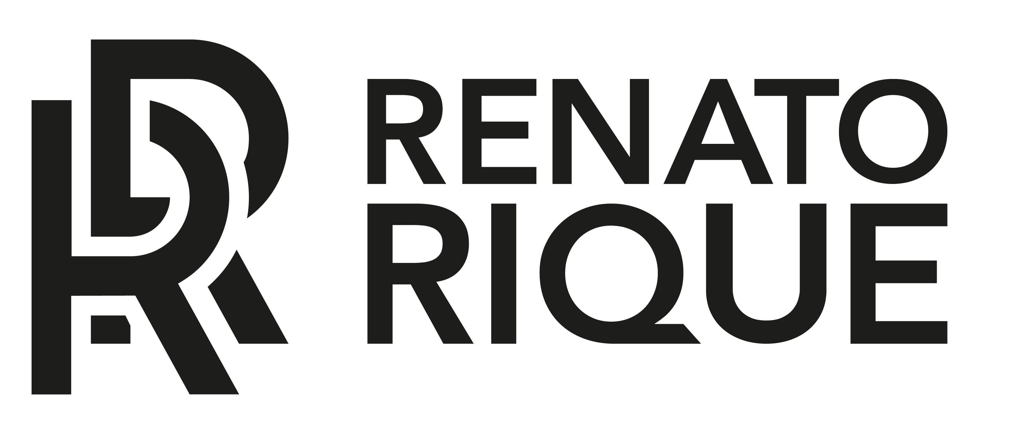
This project consists of building my personal brand, for that I decided to adopt the middle part of my name, “Renato Rique” to serve as a basis for such development, the repetition of the consonants “R”, causing a visual perception of current forming the symbol of a monogram, reinforcing the idea of a link, of connection, were the main reasons that guided this choice.
During the process, I will demonstrate the typographies chosen for the construction of the logo, the one for main use and support, a brief summary on the design of the symbol and its construction, security measures, variations and colors, patterns and applicability both in the digital and in printed materials.
| Concept |
The construction of the symbol is based on the use of the letter R, initials of my middle name and surname, to create and allude to an intertwined chain, giving rise to the main and guiding concept of the brand of bonding and unity. Thus symbolizing a link between the need and the resolution of the problem, between the client and his public, desire and conquest, between creative design and the message to be communicated.
I chose two modern typography to compose the brand being "Avenir Family" for main typography, and "Poppins Family" for support typography.
| Color Palette |
The choice of the most vibrant and striking neon green color is due to reasons intrinsically linked to the brand's concept, the choice to be one of the main colors that make up the brand's identity, is due to the message and meaning that it carries, a color that conveys energy, innovation, vitality, joy and of course everything that corresponds to digital, futurism and creative dynamism. Consequently, as it is a neon color, I purposely reserve its usability for digital materials, not including most printed materials due to the difficulty of faithfully reproducing its hue, especially with regard to personalized stationery.
Therefore, I reserve the use of the other colors that make up the identity, such as Indigo (purple) and the monochromatic ones, black, white and their shade variations, for printed materials.
| Pattern |
The construction of a standard for the brand took place in a freer and more detached way, unlike the usual, where there is an exactly equal repetition of a certain element occupying a delimited space. Contrary to this practice, I chose to use the letter R that makes up the logo to serve as a base, and to create geometric shapes and modular straight segments, giving more freedom and dynamism in its use, regardless of the material in which it is applied and consequently creating a visual and figurative association with the brand, almost adopting a texture function in certain cases.


